在类组件中为组件添加属性及属性的约束、校验需要用到一个新的装饰器:@Prop,支持 default、required、type、validator 4 个选项。
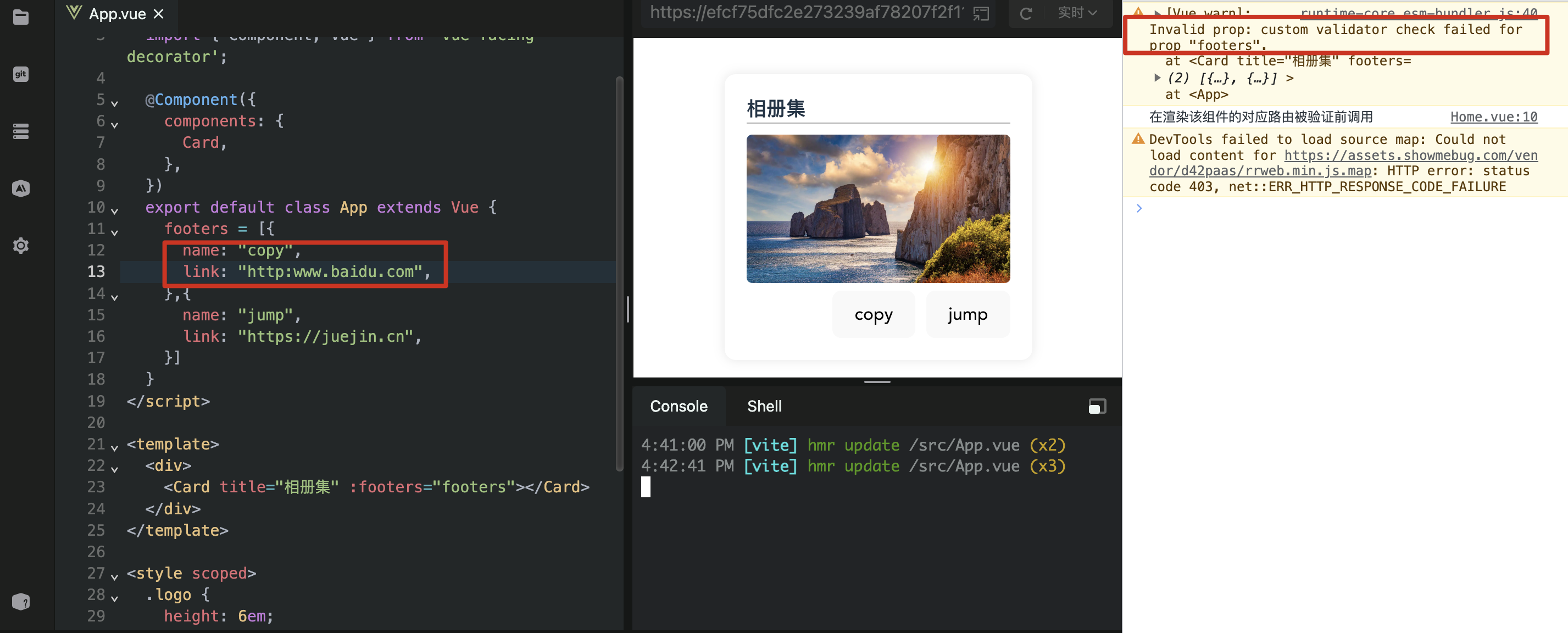
下面的代码通过一个简单的示例来演示对于类组件属性的约束选项。如未配置必传的属性或被自定义校验所拦截将会来控制台进行⚠️警告提示:
vue
<script lang="ts">
  import { Component, Prop, Vue } from 'vue-facing-decorator';

  @Component({
    name: 'Card',
  })
  export default class Card extends Vue {
    @Prop({
      required: true,
    })
    title!: string;

    @Prop({
      default:
        'https://www.bing.com/th?id=OHR.PandiZucchero_ZH-CN9833521922_1920x1080.webp',
      type: String,
    })
    cover!: string;

    @Prop({
      type: Array<{
        name: string;
        link: sttring;
      }>,
      validator(val: any) {
        return val.every((v: any) =>
          new RegExp(/^(ftp|http|https):\/\/[^ "]+$/).test(v.link)
        );
      },
    })
    footers!: any;
  }
</script>

<template>
  <div class="container">
    <div class="title">{{ title }}</div>
    <img :src="cover" />
    <div class="footer">
      <button v-for="footer in footers">{{ footer.name }}</button>
    </div>
  </div>
</template>

<style scoped>
  .container {
    text-align: left;
    width: 240px;
    background-color: #fff;
    border-radius: 10px;
    box-shadow: 0px 0px 10px rgba(0, 0, 0, 0.1);
    padding: 20px;
    margin: 20px;
    transition: 0.2s;
  }

  .container:hover {
    transform: scale(1.01);
    box-shadow: 0px 0px 10px rgba(0, 0, 0, 0.3);
  }

  .container .title {
    font-size: 18px;
    font-weight: 600;
    border-bottom: 1px solid rgba(0, 0, 0, 0.3);
  }

  .container img {
    width: 240px;
    height: 135px;
    border-radius: 5px;
    margin-top: 10px;
  }

  .container .footer {
    display: flex;
    gap: 10px;
    justify-content: right;
  }
</style>